Layouts
Define all visible elements in the layout section. The elements are structured in rows spread across a 12-column grid.
There can be:
- Form elements inside an attribute form widget
- Attributes inside a layout widget
- Specialized widgets for certain customizable areas
By using width on an element, you can modify the number of columns this
element occupies. You can embed widgets Inside a layout or form widget, for example, a
product_unit_price inside a form widget. For advanced configuration, both rows and cells can
also have conditions to show elements based on the value of attributes.
Layout Row Configuration
The following table describes layout row configuration:
| Name | Type | Description |
| layout | array | As array of layout columns |
| condition | string | An expression to switch the row visibility |
Layout Column Configuration
The following table describes layout column configuration:
| Name | Type | Description |
| id | string | The widget ID |
| attribute | string | The attribute reference inside a form or layout
widget
|
| width | integer (1 <= width <= 12) | Number of grid cells the column occupies |
| offset | integer (1 <= width <= 12) | Number of grid sets to leave empty before this element. Either Offset + Width
total 12 or
"end".
|
| end | Boolean | Specify to leave empty until the end of the
row.
|
| condition | string | An expression to switch the row visibility. |
Layout Conditions
Layout conditions include the following:
| Operator | Description | Example |
| > | Greater than operator. Evaluates to true if the left side is greater that the right side. | 5 > 3 |
| >= | Greater than or equal to operator. Evaluates to true if the left side is greater than or equal to the right side. | 5 >= 5 |
| < | Less than operator. Evaluates to true if the left side is less than the right side. | 3 < 5 |
| <= | Less than or equal to operator. Evaluates to true if the left side is less than or equal to the right side. | 3 <= 3 |
| == | Equality comparison. Returns true if the left side equals the right side. Does not check type equality. | 3 == '3' |
| != | Inequality comparison. Returns true if the left side equals the value and type of the right side. Does not check type inequality. | 3 != 2 |
| === | Strict equality comparison. Returns true if the left side equals the value and type of the right side. | 3 === 3 |
| !== | Strict inequality comparison. Returns true if the left side doesn't equal the value of the right side and both types are the same. | 3 !== '3' |
| ! | Negation operator. Negates the Boolean value. | !true |
| && | Logical AND operator. | true && true |
| || | Logical OR operator. | true || false |
The following sample condition would hide the associated widget until the current product doesn't require variation selection anymore.
"condition": "!type.master"Configuring Width
You use the
width property to specify how many columns an element
spans.
The following is an example of specifying the width. Because
of the nested layout, the same result would be achieved without
width.
{
"id": "address",
"layout": [
{
"layout": [
{
"attribute": "first_name",
"width": 6
},
{
"attribute": "last_name",
"width": 6
}
]
},
{
"layout": [
{
"attribute": "postal_code",
"width": 6
},
{
"attribute": "city",
"width": 6
}
]
}
]
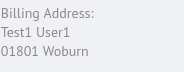
}The following is a sample for width without
nested layouts:
{
  "id": "address",
  "layout": [
    {
      "attribute": "first_name",
      "width": 6
    },
    {
      "attribute": "last_name",
      "width": 6
    },
    {
      "attribute": "postal_code",
      "width": 6
    },
    {
      "attribute": "city",
      "width": 6
    }
  ]
}
It results in a layout like this:
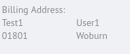
Combining Elements
By using the property
suppress_new_column, you can combine multiple elements in
one cell. Each element with the property
suppress_new_column:true is added to the cell of the
previous element.
{
  "id": "address",
  "layout": [
    {
      "layout": [
        {
          "attribute": "first_name"
        },
        {
          "attribute": "last_name",
          "suppress_new_column": true
        }
      ]
    },
    {
      "layout": [
        {
          "attribute": "postal_code"
        },
        {
          "attribute": "city",
          "suppress_new_column": true
        }
      ]
    }
  ]
}
Each element with the property
suppress_new_column:true is added to the cell of the
previous element.